
R can easily generate random samples from a whole library of probability distributions. We might want to do this to gain insight into the distribution's shape and properties. A tricky aspect of statistics is that results like the central limit theorem come with caveats, such as "...for sufficiently large n...". Getting a feel for how large is sufficiently large, or better yet, testing it, is the purpose of the simulations in chapter 6 of John Verzani's Using R for Introductory Statistics.
The central limit theorem says that the sample mean drawn from any parent population will tend towards being normally distributed as n, the size of the sample, grows larger. The sample size needed so that the normal distribution reasonably approximates the sample mean varies from one type of distribution to another.
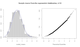
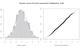
A general form of a test that allows us to eyeball the accuracy of the approximation would look something like the code below, which generates and takes the mean of 300 samples drawn from any of R's random number generation functions (rnorm, runif, rbinom, rexp, rt, rgeom, etc.), scaling the sample means to a mean of zero and standard deviation of one. In a two panel plot the function first plots a histogram and a density curve along with the standard normal curve for comparison, and then does a quantile-quantile plot comparing the sample to a normal distribution.
plot_sample_means <- function(f_sample, n, m=300,title="Histogram", ...) {

  # define a vector to hold our sample means
  means <- double(0)

  # generate 300 samples of size n and store their means
  for(i in 1:m) means[i] = mean(f_sample(n,...))

  # scale sample means to plot against standard normal
  scaled_means <- scale(means)

  # set up a two panel plot
  par(mfrow=c(1,2))
  par(mar=c(5,2,5,1)+0.1)

  # plot histogram and density of scaled means
  hist(scaled_means, prob=T, col="light grey", border="grey", main=NULL, ylim=c(0,0.4))
  lines(density(scaled_means))

  # overlay the standard normal curve in blue for comparison
  curve(dnorm(x,0,1), -3, 3, col='blue', add=T)

  # adjust margins and draw the quantile-quantile plot
  par(mar=c(5,1,5,2)+0.1)
  qqnorm(means, main="")

  # return margins to normal and go back to one panel
  par(mar=c(5,4,4,2)+0.1)
  par(mfrow=c(1,1))

  # add a title
  par(omi=c(0,0,0.75,0))
  title(paste(title, ", n=", n, sep=""), outer=T)
  par(omi=c(0,0,0,0))

  # return unscaled means (without printing)
  return(invisible(means))
}
This function shows off some of the goodness that the R programming language adopts from the functional school of programming languages. First, note that it's a function that takes another function as an argument. Like most modern languages, R treats functions as first-class objects. Also note the use of the ellipsis to pass arbitrary arguments onward to the f_sample function. All of the r_ functions take n as a parameter. But, aside from that, the parameters differ. The ability to handle situations like this makes R's ellipsis a bit more powerful than the similar looking varargs functions in C-style languages.
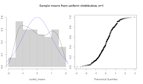
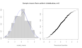
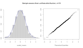
Note what happens for n=1. In this case, the sample mean is just a sample. So, as n increases, we can morph any distribution into the normal. For instance, here's a series of plots of sample means drawn from the uniform distribution. We start at n=1, which looks flat as expected. At n=2 we already get a pretty good fit to the normal curve, except at the tails. The n=10 case closely fits to the normal.
> plot_sample_means(runif, n=1, title="Sample means from uniform distribution")
> plot_sample_means(runif, n=2, title="Sample means from uniform distribution")
> plot_sample_means(runif, n=10, title="Sample means from uniform distribution")
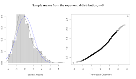
Trying the same trick with other distributions yields different results. The exponential distribution takes a while to loose it's skew. Here are plots for n=6, 12, and 48.
> plot_sample_means(rexp, n=6, title="Sample means from the exponential distribution", rate=1)
> plot_sample_means(rexp, n=12, title="Sample means from the exponential distribution", rate=1)
> plot_sample_means(rexp, n=48, title="Sample means from the exponential distribution", rate=1)
I'm guessing that Verzani's purpose with the simulations in this chapter is for the reader to get some intuitive sense of the properties of these distributions and their relationships, as an alternative to delving too deeply into theory. This lets us stick to applying statistical tools, while giving us some handle on how things might go wrong.
Hi Chris,
ReplyDeletegreat post as usual. Unfortunately, I'm having some problems trying to replicate your graphs using the plot_sample_means function. Would you please post the code of one of the examples?
Many thanks in advance,
Ruben
Hi Ruben,
ReplyDeleteSorry, I guess I left an important piece out. I added the commands to create the graphics. I hope that helps.
The general form is:
plot_sample_means(f, n, m, title, ...)
f is a random number generating function (rnorm, runif, etc.)
n is the size of the sample
m is the number of samples to generate
title is the title of the graphic
...followed by any additional parameters required by the r___ function