Friday, April 27, 2012

Sage Bionetworks Synapse

Michael Kellen, Director of Technology at Sage Bionetworks, is trying to build a GitHub for science. It's called Synapse and Kellen described it in a talk at the Sage Bionetworks Commons Congress 2012, this past weekend: 'Synapse' Pilot for Building an 'Information Commons'.

To paraphrase a Kellen's intro:

Science works better when people build off of each other's works. Every great advance is preceded by a multitude of smaller advances. It's no accident that the invention of the printing press and the emergence of the first scientific journals coincide with the many great scientific discoveries of the age of enlightenment. But scientific journals are stuck in a paradigm revolving around the printing press. In other domains, namely open source software, people are more radically reinventing systems for sharing information with each other. Github is a collaborative environment for the domain of software. Synapse aims to be a similar environment for medical and genomic research.

The Synapse concept of a project packages together data and the code to process it. I tried to download the R script shown in the contents and couldn't, either because I'm a knucklehead or because Synapse is a work in progress. On the plus side, they give you a helpful cut-n-paste snippet of R code in the lower right corner to access the project through their R API. When this is fully implemented, it could provide a key piece of computing infrastructure for reproducible data-driven science.

Sage intends to explore ways of connecting to traditional scientific journals. Picture figures that link to interactive visualizations or computational methods that link to code. I'm a big fan of the "live document" concept and it would be great to see journal articles evolve in that direction.

An unintended consequence of NGS, Robert Gentleman points out, is that the data is too big for existing pipes. Any concept of a GitHub for science will have to incorporate processing biological data in the cloud. I could imagine a Synapse project containing data sets, code and a recipe for standing up an EC2 instance (or several). At a click, a scripted process would run, bootstrapping the machines, installing software and dependencies, running a processing pipeline, and visualizing the results in a browser. How would that be for reproducible science?

Michael Kellen's blog has a bunch of interesting stuff about why building a GitHub for biology is more fun than selling sheets. I bet it is.

Wednesday, April 11, 2012

Interactive Dynamics for Visual Analysis

“To be most effective, visual analytics tools must support the fluent and flexible use of visualizations at rates resonant with the pace of human thought.”

This comes from a recent paper by Jeffrey Heer of Stanford's Visualization Group and Ben Schneiderman titled Interactive Dynamics for Visual Analysis in ACM Queue, following up on another Queue article from 2010 by Jeffrey Heer, Michael Bostock and Vadim Ogievetsky, A Tour Through the Visualization Zoo. The Interactive Dynamics article categorizes aspects of visual analysis that deserve careful consideration when designing visual analysis tools.

Taxonomy of interactive dynamics for visual analysis

  • Data and View Specification
    • Visualize
    • Filter
    • Sort
    • Derive (values or models)
  • View Manipulation
    • Select
    • Navigate (zoom, drill-down)
    • Coordinate (linked views)
    • Organize (multiple windows)
  • Analysis Process & Provenance
    • Record
    • Annotate
    • Share
    • Guide

Heer and collaborators created a series of software libraries for interactive visualization: prefuse, flare, Protovis and D3. These frameworks are designed to "represent data to facilitate reasoning", "flexibly construct representations" and "enable representational shifts" or transformations.

Protovis, which I've fooled around with a bit, is a functional domain specific language for data visualization. It's successor, D3 (Data Driven Documents), is an adaptation that increases performance and expressivity by making more direct use of the model (the DOM) inherent in the browser.

Jeffrey Heer spoke recently at the University of Washington (video available) about his research, citing as an early influence a 1962 paper by John W. Tukey titled The Future of Data Analysis.

In some ways, Heer nicely echoes themes from Hadley Wickam's talk on Engineering Data Analysis.

Data analysis pipeline:

Heer outlines an iterative process with these steps: Acquisition > Cleaning > Integration > Visualization > Modeling > Presentation > Dissemination.

Also from the Interactive Dynamics paper:

“In concert with data-management systems and statistical algorithms, analysis requires contextualized human judgments regarding the domain-specific significance of the clusters, trends, and outliers discovered in data.”

I've been a Jeffrey Heer fan-boy for some time, starting with his 2006 paper, Software Design Patterns for Information Visualization. Those interested in learning data science skills could do a lot worse than study Jeffrey Heer's work.

More papers

Thursday, March 29, 2012

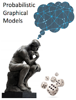
Probabilistic graphical models

Probabilistic graphical models class

I'm taking Daphne Koller's class on Probabilistic Graphical Models. Wish me luck - it looks tough. So, first off, why graphical models?

The first chapter of the book lays out the rational. PGMS are a general framework that can be used to allow a computer to take the available information about an uncertain situation and reach conclusions, both about what might be true in the world and about how to act. Uncertainty arises because of limitations in our ability to observe the world, limitations in our ability to model it, and possibly even because of innate nondeterminism. We can only rarely (if ever) provide a deterministic specification of a complex system. Probabilistic models make this fact explicit, and therefore often provide a model which is more faithful to reality.

More concretely, our knowledge about the system is encoded the graphical model which helps us exploit efficiencies arising from the structure of the system.

Distributions over many variables can be expensive to represent naively. For example, a table of joint probabilities of n binary variables requires storing O(2n) foating-point numbers. The insight of the graphical modeling perspective is that a distribution over very many variables can often be represented as a product of local functions that each depend on a much smaller subset of variables. This factorization turns out to have a close connection to certain conditional independence relationships among the variables - both types of information being easily summarized by a graph. Indeed, this relationship between factorization, conditional independence, and graph structure comprises much of the power of the graphical modeling framework: the conditional independence viewpoint is most useful for designing models, and the factorization viewpoint is most useful for designing inference algorithms

An Introduction to Conditional Random Fields by Charles Sutton and Andrew McCallum

Bayesian networks and Markov networks (aka Markov random fields) are the two basic models used in the class, the key difference being directed vs. undirected edges. In a Bayesian network, the edges are directed while they are undirected in a Markov network.

How are these different kinds of graphic models related? Let's hope we'll find out.

There's a study group meetup here at the Institute for Systems Biology (and maybe other locations) on Thursday night. Come join us, if you're in Seattle and you're doing the class.

Supplemental reading

Friday, March 23, 2012

Applying Semantic Web Services to bioinformatics

Applying Semantic Web Services to bioinformatics: Experiences gained, lessons learnt
Phillip Lord, Sean Bechhofer, Mark D. Wilkinson, Gary Schiltz, Damian Gessler, Duncan Hull, Carole Goble, and Lincoln Stein
International Semantic Web Conference, Vol. 3298 (2004), pp. 350-364, doi:10.1007/b102467

Applying Semantic Web Services to bioinformatics is a 2004 paper on Semantic Web Services in context of bioinformatics, based on the experiences of the myGrid and BioMoby projects. The important and worthy goal behind these projects is enabling composition and interoperability of heterogeneous software. Is Semantic Web technology the answer to data integration in biology? I'm a little skeptical.

Here's a biased selection of what the paper has to say:

  • "The importance of fully automated service discovery and composition is an open question. It is unclear whether it is either possible or desirable, for all services, in this domain..."
  • "Requiring service providers and consumers to re-structure their data in a new formalism for external integration is also inappropriate."
  • "Bioinformaticians are just not structuring their data in XML schema, because it provides little value to them."
  • "All three projects have accepted that much of the data that they receive will not be structured in a standard way. The obvious corollary of this is that without restructuring, the information will be largely opaque to the service layer."

A couple of interesting asides are addressed:

  • Most services or operations can be described in terms in inputs and outputs and configuration parameters or secondary input. When building a pipeline, only main input and output need be considered, leaving parameters for later.
  • A mixed a user base divided between biologists and bioinformaticians is one difficulty noted in the paper. I've also found that tricky. Actually, the situation has changed since the article was written. Point-and-click biologists are getting to be an endangered species. The crop of biologists I see coming up these days is very computationally savvy. What I think of as the scripting-enabled biologist is a lot more common. Those not so enabled are increasingly likely to specialize in wet-lab work and do little or no data analysis.

In BioMOBY Successfully Integrates Distributed Heterogeneous Bioinformatics Web Services. The PlaNet Exemplar Case, (2005) Wilkinson writes,

...interoperability in the domain of bioinformatics is, unexpectedly, largely a syntactic rather than a semantic problem. That is to say, interoperability between bioinformatics Web Services can be largely achieved simply by specifying the data structures being passed between the services (syntax) even without rich specification of what those data structures mean (semantics).

In The Life Sciences Semantic Web is Full of Creeps!, (2006) Wilkinson and co-author Benjamin M. Good write, "both sociological and technological barriers are acting to inhibit widespread adoption of SW technologies," and acknowledge the complexity and high curatorial burden.

The Semantic Web for the Life Sciences (SWLS), when realized, will dramatically improve our ability to conduct bioinformatics analyses... The ultimate goal of the SWLS is not to create many separate, non-interacting data warehouses (as we already can), but rather to create a single, ‘crawlable’ and ‘queriable’ web of biological data and knowledge... This vision is currently being delayed by the timid and partial creep of semantic technologies and standards into the resources provided by the life sciences community.

These days, Mark Wilkinson is working on SADI, which “defines an open set of best-practices and conventions, within the spectrum of existing standards, that allow for a high degree of semantic discoverability and interoperability”.

More on the Semantic Web

...looks like this old argument is still playing out.

Tuesday, March 20, 2012

Finding the right questions

A 2010 PLOS Biology article, Finding the right questions: exploratory pathway analysis to enhance biological discovery in large datasets, makes some good points about exploratory analysis of noisy biological data and the design of software to help do it.

At a time when biological data are increasingly digital and thus amenable to computationally driven statistical analysis, it is easy to lose sight of the important role of data exploration. Succinctly defined over 30 years ago by John Tukey, exploratory data analysis is an approach to data analysis that focuses on finding the right question, rather than the right answer. In contrast to confirmatory analysis, which involves testing preconceived hypothesis, exploratory data analysis involves a broad investigation, a key component of which may be visual display. Though his arguments predate personal computing and thus focus on graph paper and ink, the point still stands: good data visualization leads to simpler (better) descriptions and underlying fundamental concepts. Today, there is tremendous potential for computational biologists, bioinformaticians, and related software developers to shape and direct scientific discovery by designing data visualization tools that facilitate exploratory analysis and fuel the cycle of ideas and experiments that gets refined into well-formed hypotheses, robust analyses, and confident results.

The authors are involved in Wikipathways, an open platform for curation of biological pathways comparable to KEGG and Ingenuity Pathway Analysis, MetaCyc, and Pathway Commons, and this provides the context for their comments. But, most of their conclusions apply more generally to software for research, where the goal is to enable “researchers to take a flexible, exploratory attitude and facilitate construction of an understandable biological story from complex data.”

...instead of aiming for a single, isolated software package, developers should implement flexible solutions that can be integrated in a larger toolbox [...], in which each tool provides a different perspective on the dataset.
For developers, realizing that exploratory pathway analysis tools might be used not only in isolation but also with other software and different types of data in a flexible analysis setup might guide software design and implementation.

Effective data integration

Flexibility and interactivity are keys to effectiveness. “Determining what to integrate and how to present it to the user depends on the context and the question being asked.” Researchers often need to follow up on a weak or uncertain signal by finding confirmatory evidence in relevant orthogonal or correlated datasets. This emphasizes the importance of well curated data, whether pathways or annotated genome assembies, which can form the scaffolding on which integration takes place.

Providing an API, in addition to UI, opens up possibilities for scripting and automation and enables advanced users to “combine functionalities of different tools to perform novel types of analysis.” The authors note that defining general data models increases reusability and unity among software tools. This resonates with my own experience. One of the key virtues of Gaggle is it's highly general data model consisting of basic data structures - list, matrix, network, table, and tuples - free of specific semantics.

Also noted are the difficulties which make current analysis tools “rather isolated and hard to combine”, specifically:

  • reformatting data
  • mapping identifiers
  • learning curve of multiple software packages

“Succinctly defined over 30 years ago by John Tukey, exploratory data analysis is an approach to data analysis that focuses on finding the right question, rather than the right answer.” We've not yet found the right answer for data integration for biology, but it's clear that “integration of annotations and data is critical to extracting the full potential from large and high-throughput datasets.” This paper contains some exceptionally clear thinking on building software tools that will help bring that about.

Citation

Kelder T, Conklin BR, Evelo CT, Pico AR (2010) Finding the Right Questions: Exploratory Pathway Analysis to Enhance Biological Discovery in Large Datasets. PLoS Biol 8(8): e1000472. doi:10.1371/journal.pbio.1000472

Tuesday, March 06, 2012

Ingenuity

When I was a little whelp, I had a brief and unsuccessful engagement at a bioinformatics startup in the bay area called Ingenuity. The company had a cool idea, a knowledge base for molecular biology, and smart and creative people to implement it. I was tasked, by a long-haired, Tufte-toting, Stanford grad-student, with developing new and rich UI elements with the budding new technology at the time, dynamic HTML. In particular, I was to implement a search bar that could automatically suggest terms from an ontology - the autocomplete feature.

There was even a prototype that sort-of worked on the right version of Netscape when the server 30 feet away. I pulled my hair out trying to get it working consistently across browsers. A better engineer, say John Resig, might have pulled it off, but I had to admit defeat. Like many DHTML toys of the time, it just wasn't ready for production. So, I recommended scrapping the idea in favor of a simple "google-box". This was not well received and my tenure was not long in coming to a close.

For years after, I'd argue on every project for simple, stripped-down web UIs. "Look at Google," I'd say, pointing to the minimalist search box. Trying to do anything advanced in a browser, I'd warn, was an invitation to cross-browser compatibility issues and nightmarish debugging sessions.

Meanwhile, as if to make me look like a bozo (as if I need any help), Google introduced autocomplete, AKA Google Suggest, first as a Google Labs project, in 2004 and finally rolled out autocomplete on the main Google page in 2008. So much for my "Look at Google" argument. Not that it matters now, but I feel slightly vindicated by the fact that it took even the mighty Google this long to deploy a feature that I was basically shit-canned for failing to implement in 2000. ...not that I'm bitter. But, anyway, back in the present day...

Doug Basset, Chief Scientific Officer at Ingenuity gave a demo last week at the ISB, where I now reside, showing off Ingenuity Variant Analysis, a new tool built on top of their knowledge base that helps find disease-causing genetic variations in resequencing data.

The basic trick is to filter down the millions of genetic variants found in any individual genome to those consistent with a given condition, starting with it's frequency in the population and genetic properties like homo- or heterozygosity. The neat part comes next.

For each variant surviving this far, the program traverses the graph of facts in the knowledge base. Of course, it will find known associations between variants or their host genes and disease. What's better, it can also find relationships a few degrees removed from direct implication. Say, A turns off B with regulates C. The biological process to which C belongs runs amok in disease X. Suddenly, a variant in a functional domain of gene A looks like an interesting candidate. If it works, you end up with a handful of genes with enough evidence to warrant further investigation.

The products's flash-based UI is very slick and modern, with drop-shadows, ghosting and barber-pole progress bars. Tables have spiffy little sparkline graphics. Right in the middle of the demo, a search dialog popped up and there was the autocomplete feature, mocking me. It's certainly no big deal these days. My current project has an autocompleting search box, too, thanks to jQuery and Solr. But, I guess the memory of flubbing that gig still has a little sting left in it.

Thursday, February 09, 2012

Twitter feature request

For a long time, I just didn't get Twitter, thinking that nothing of substance could fit in 140 characters. The way I've come to use it is like scanning the headlines on a newspaper, following links to read more about interesting items. I follow folks that are interested in the same nerdy topics I am, in effect like a personal slashdot or hacker news with the riff-raff filtered out, or rather the interesting people filtered in.

Still, my cluster of interests is eclectic and my interests tend to only partially overlap with the people I follow. So, what I want is a feature that will help automatically weed out the stuff I don't care about.

I mostly read tweets on my phone using the Android version of TweetDeck. What if I could swipe right on a tweet for something I like, and swipe left to shit-can a lame tweet? The app could keep track of what I've liked or not and use that as an ever-growing training set to classify new tweets as interesting or dreck. The same data could also be used to find people I should follow or interesting tweets from people I don't necessarily want to follow, etc.

In my case, the app would soon learn to terminate sports-related tweets with deadly efficiency. Also, for you foursquare users, any tweet that starts with "I'm at..." would be ruthlessly eliminated. It would work great for facebook feeds as well, deleting all those "Your sister-in-law just unlocked the Cattywampus badge on whatever-game".

This must already exist. Is this what prismatic is? Maybe, I'll find out if I get my invite!

Update

Looks like I'm not the only one wanted to waste time more efficiently. Seattle hacker Joel Grus built a classifier for Hacker News stories using naive Bayes. Joel gave a nice lightning talk at the latest Seattle Data/Analytics/Machine-Learning MeetUp.