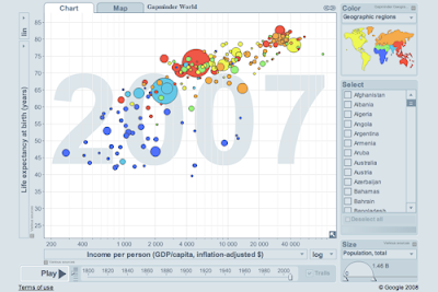
 Information graphics is becoming such a hot area. Edward Tufte was just in business week (slides). I want to be a data scientist when I grow up. One potential role mode is Hans Rosling, the swedish professor behind Gapminder. He has talks on economic development and poverty which use their trendalyzer software. That makes me want to acquire the three skills of data geeks, stats, data munging, and visualization.
Sunday, June 28, 2009
Information Visualization
Information graphics is becoming such a hot area. Edward Tufte was just in business week (slides). I want to be a data scientist when I grow up. One potential role mode is Hans Rosling, the swedish professor behind Gapminder. He has talks on economic development and poverty which use their trendalyzer software. That makes me want to acquire the three skills of data geeks, stats, data munging, and visualization.
Sunday, June 21, 2009
Semantic data in life science
When I first saw RDF I said, "Blech!" Well, that's also what I said when I first saw HTML. But, I'm coming around to it. Sure, it's not pretty, but RDF is a graph and graphs are cool. And, we're starting to see more and more that the relational model of data works less well in some situations than it does in transaction processing, while RDF related tools are moving from vaporware to something more practical.
With the web, a new data model is growing up which can be generalized as a graph, where nodes and edges have properties, plus indexes to quickly find sets of nodes in the graph. The web and its search engines are an instance of this pattern. As the web becomes a channel for structured data, it gets more natural to model your data like this, too. Biology has a great tradition of open data and the network is already a workhorse of modern biology. So, why not structure you data that way?
Tim Berners-Lee, in a TED-talk on the blooming of Linked Data, points out the huge untapped potential of integrating the separate data silos distributed all over the web. Because biology was an early adopter of open data, some of its key assets are open, but poorly linked and not very programmable. Maybe the Semantic Web of Life Science will change that particularly in Systems Biology, which demands the integration of diverse types of data.
Clay Shirky criticized the semantic web for its links to AI, and deductive reasoning, asking "What is the Semantic Web good for?" Well, maybe data integration, rather than inference, is the answer.
- Linked Data - Connect Distributed Data across the Web
- Web as platform: Linking data. RDF stores and augmentation
- DBpedia
- Freebase
- Talis
- Programmable Web
- Bio2RDF and their blog
- Gene Expression Atlas
Hack biology in your garage
One of the beautiful things about computing is that you don't need anyone's permission. You can set yourself up to do real software engineering or computer science so inexpensively that you need no sponsorship from a corporation or academic institution. This is one of the keys to the amazing creativity that's come out of computing in the past few decades. Now, the same effect is showing up in biology. There's a whole DIY movement, described in an article in h+:
The age of the DIYbiologist has begun. With the price of equipment falling and the open source ideology flourishing, it was perhaps inevitable[.] Primarily interested in the currently fashionable trend of synthetic biology — the creation of novel organisms using genetics and other techniques — they meet in groups, in cities, and unite online.
Friday, June 05, 2009
Practical semantic web
Toby Segaran, author of the super-fun Programming Collective Intelligence, has a nice talk titled Why Semantics? available about practical semantic web. If you immediately think of jumbo shrimp or military intelligence, you're not alone. But, his talk isn't pie-in-the-sky. He explains some of the contortions commonly used to shoe-horn freeform data into relational databases, then shows that these issues are being addressed using the graph databases that are part of the semantic web effort.
His upcoming book on the subject is Programming the Semantic Web.
He mentions a few good resources:
| Sesame - a RDF data store |
| Exhibit from MIT's Simile project |
| Linking Open Data |
| Geonames |
| Music Brainz |
| Freebase |
Tuesday, June 02, 2009
How to plot a graph in R

Here's a quick tutorial on how to get a nice looking graph out of R (aka the R Project for Statistical Computing). Don't forget that help for any R command can be displayed by typing the question mark followed by the command. For example, to see help on plot, type ?plot.
Let's start with some data from your friends, the Federal Reserve. The fed keeps lots of interesting economic data and they make it pretty easy to get at. What if we're curious about the value of the US Dollar? How's it doing against other major currencies? Let's have a look. I'll use the Nominal Major Currencies Dollar Index. The fed gives us the data here:
http://www.federalreserve.gov/releases/h10/Summary/
First, download the file and load it into your favorite text editor. Replace \s\s+ with \t to create two tab delimited columns. I think this is probably easier than trying to get R to read data separated by at least 2 spaces, as the source file seems to be. Now, load your data into R.
d = read.table('dollar_vs_major_currencies_index.txt', header=F, sep="\t", col.names=c("month", "index"))
dim(d)
[1] 437   2
head(d)
     month    index
1 JAN 1973 108.1883
2 FEB 1973 103.7461
3 MAR 1973 100.0000
4 APRimg 1973 100.8251
5 MAY 1973 100.0602
6 JUN 1973  98.2137
R will show you the structure of an object using the str() command:
str(d)
'data.frame': 437 obs. of  2 variables:
 $ month: Factor w/ 437 levels "APR 1973","APR 1974",..: 147 110 256 1 293 220 184 38 402 366 ...
 $ index: num  108 104 100 101 100 ...
So far so good. R is all about stats, so why not do this?
summary(d$index)
   Min. 1st Qu.  Median    Mean 3rd Qu.    Max.
  70.32   87.93   95.89   97.48  105.40  143.90
OK, let's get to some plotting. First off, let's try a simple case.
plot(d$index)

That's OK for quickly looking at some data, but doesn't look that great. R can make reasonable guesses, but creating a nice looking plot usually involves a series of commands to draw each feature of the plot and control how it's drawn. I've found that it's usually best to start with a stripped down plot, then gradually add stuff.
Start out bare-bones. All this does is draw the plot line itself.
plot(d$index, axes=F, ylim=c(0,150), typ='l', ann=F)
| axes=F | don't draw axes |
| ann=F | don't draw annotations, by which they mean the titles for the plot and the axes |
| typ='l' | draw a line plot |
| ylim | set limits on y axis |
Next, let's add the x-axis nicely formatted. We'll use par(tcl=-0.2) to create minor tick marks. The first axis command draws those, but doesn't draw labels. The second axis command draws the major tick marks and labels the years on even decades.
par(tcl= -0.2)
axis(1, at=seq(1, 445, by=12), labels=F, lwd=1, lwd.ticks=1)
par(tcl= -0.5)
axis(1, at=seq(1 + 12*2, 450, by=60), labels=seq(1975,2010,5), lwd=0, lwd.ticks=2)
Note that there's an R package called Hmisc, which might have made these tick marks easier if I had figured it out. Next, we'll be lazy and let R decide how to draw the y-axis.
axis(2)
I like a grid that helps line your eye up with the axes. There's a grid command, which seemed to draw grid lines wherever it felt like. So, I gave up on that and just drew my own lines that matched my major tick marks. The trick here is to pass a sequence in as the argument for v or h (for vertical and horizontal lines). That way, you can draw all the lines with one command. Well, OK, two commands.
abline(v=(12*(seq(2,32,by=5)))+1, col="lightgray", lty="dotted")
abline(h=(seq(0,150,25)), col="lightgray", lty="dotted")
Let's throw some labels on with the title command.
title(main="Nominal Major Currencies Dollar Index", sub="Mar 1973 = 100.00", ylab="US$ vs major currencies")
Finally, let's bust out a linear regression. The lm() function, which fits a linear model to the data, has some truly bizarre syntax using a ~ character. The docs say, "The tilde operator is used to separate the left- and right-hand sides in model formula. Usage: y ~ model." I don't get at all how this is an operator. It seems to mean y is a function of model? ...maybe? In any case, this works. I'm taking it as voodoo.
linear.model = lm(d$index ~ row(d)[,1])
abline(linear.model)
Now, we have a pretty nice looking plot.

The full set of commands is here, for your cutting-and-pasting pleasure.
plot(d$index, axes=F, ylim=c(0,150), typ='l', ann=F)
par(tcl= -0.2)
axis(1, at=seq(1, 445, by=12), labels=F, lwd=1, lwd.ticks=1)
par(tcl= -0.5)
axis(1, at=seq(1 + 12*2, 450, by=60), labels=seq(1975,2010,5), lwd=0, lwd.ticks=2)
par(tcl= -0.5)
axis(2)
abline(v=(12*(seq(2,32,by=5)))+1, col="lightgray", lty="dotted")
abline(h=(seq(0,150,25)), col="lightgray", lty="dotted")
title(main="Nominal Major Currencies Dollar Index", sub="Mar 1973 = 100.00", ylab="US$ vs major currencies")
linear.model = lm(d$index ~ row(d)[,1])
abline(linear.model, col="blue")
...more on R.
Subscribe to:
Posts (Atom)


 R Bloggers