Here's a quick tutorial on how to get a nice looking graph out of R (aka the R Project for Statistical Computing). Don't forget that help for any R command can be displayed by typing the question mark followed by the command. For example, to see help on plot, type ?plot.
Let's start with some data from your friends, the Federal Reserve. The fed keeps lots of interesting economic data and they make it pretty easy to get at. What if we're curious about the value of the US Dollar? How's it doing against other major currencies? Let's have a look. I'll use the Nominal Major Currencies Dollar Index. The fed gives us the data here:
http://www.federalreserve.gov/releases/h10/Summary/
First, download the file and load it into your favorite text editor. Replace \s\s+ with \t to create two tab delimited columns. I think this is probably easier than trying to get R to read data separated by at least 2 spaces, as the source file seems to be. Now, load your data into R.
d = read.table('dollar_vs_major_currencies_index.txt', header=F, sep="\t", col.names=c("month", "index"))
dim(d)
[1] 437   2
head(d)
     month    index
1 JAN 1973 108.1883
2 FEB 1973 103.7461
3 MAR 1973 100.0000
4 APRimg 1973 100.8251
5 MAY 1973 100.0602
6 JUN 1973  98.2137
R will show you the structure of an object using the str() command:
str(d)
'data.frame': 437 obs. of  2 variables:
 $ month: Factor w/ 437 levels "APR 1973","APR 1974",..: 147 110 256 1 293 220 184 38 402 366 ...
 $ index: num  108 104 100 101 100 ...
So far so good. R is all about stats, so why not do this?
summary(d$index)
   Min. 1st Qu.  Median    Mean 3rd Qu.    Max.
  70.32   87.93   95.89   97.48  105.40  143.90
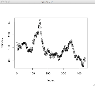
OK, let's get to some plotting. First off, let's try a simple case.
plot(d$index)

That's OK for quickly looking at some data, but doesn't look that great. R can make reasonable guesses, but creating a nice looking plot usually involves a series of commands to draw each feature of the plot and control how it's drawn. I've found that it's usually best to start with a stripped down plot, then gradually add stuff.
Start out bare-bones. All this does is draw the plot line itself.
plot(d$index, axes=F, ylim=c(0,150), typ='l', ann=F)
| axes=F | don't draw axes |
| ann=F | don't draw annotations, by which they mean the titles for the plot and the axes |
| typ='l' | draw a line plot |
| ylim | set limits on y axis |
Next, let's add the x-axis nicely formatted. We'll use par(tcl=-0.2) to create minor tick marks. The first axis command draws those, but doesn't draw labels. The second axis command draws the major tick marks and labels the years on even decades.
par(tcl= -0.2)
axis(1, at=seq(1, 445, by=12), labels=F, lwd=1, lwd.ticks=1)
par(tcl= -0.5)
axis(1, at=seq(1 + 12*2, 450, by=60), labels=seq(1975,2010,5), lwd=0, lwd.ticks=2)
Note that there's an R package called Hmisc, which might have made these tick marks easier if I had figured it out. Next, we'll be lazy and let R decide how to draw the y-axis.
axis(2)
I like a grid that helps line your eye up with the axes. There's a grid command, which seemed to draw grid lines wherever it felt like. So, I gave up on that and just drew my own lines that matched my major tick marks. The trick here is to pass a sequence in as the argument for v or h (for vertical and horizontal lines). That way, you can draw all the lines with one command. Well, OK, two commands.
abline(v=(12*(seq(2,32,by=5)))+1, col="lightgray", lty="dotted")
abline(h=(seq(0,150,25)), col="lightgray", lty="dotted")
Let's throw some labels on with the title command.
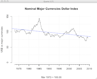
title(main="Nominal Major Currencies Dollar Index", sub="Mar 1973 = 100.00", ylab="US$ vs major currencies")
Finally, let's bust out a linear regression. The lm() function, which fits a linear model to the data, has some truly bizarre syntax using a ~ character. The docs say, "The tilde operator is used to separate the left- and right-hand sides in model formula. Usage: y ~ model." I don't get at all how this is an operator. It seems to mean y is a function of model? ...maybe? In any case, this works. I'm taking it as voodoo.
linear.model = lm(d$index ~ row(d)[,1])
abline(linear.model)
Now, we have a pretty nice looking plot.

The full set of commands is here, for your cutting-and-pasting pleasure.
plot(d$index, axes=F, ylim=c(0,150), typ='l', ann=F)
par(tcl= -0.2)
axis(1, at=seq(1, 445, by=12), labels=F, lwd=1, lwd.ticks=1)
par(tcl= -0.5)
axis(1, at=seq(1 + 12*2, 450, by=60), labels=seq(1975,2010,5), lwd=0, lwd.ticks=2)
par(tcl= -0.5)
axis(2)
abline(v=(12*(seq(2,32,by=5)))+1, col="lightgray", lty="dotted")
abline(h=(seq(0,150,25)), col="lightgray", lty="dotted")
title(main="Nominal Major Currencies Dollar Index", sub="Mar 1973 = 100.00", ylab="US$ vs major currencies")
linear.model = lm(d$index ~ row(d)[,1])
abline(linear.model, col="blue")
...more on R.


 R Bloggers
Thanks, you cover a number of issues I've been struggling with!
ReplyDeleteSome lines are truncated and I can't really print out the whole content, though - maybe you could send a copy to me?
I fix the HTML to get SyntaxHightlighter sorta working. I hope that helps.
ReplyDeleteI can't send you anything w/o an address and I hate to put email addresses in a blog where they're so easily scraped by spammers.
My address is in my profile.
do you know how would you use grid() to get the grid lines to line up with the tick marks?
ReplyDeletePJC< I tried to get grid to line up how I wanted, but couldn't. That's why I ended up using abline. I'm sure it's possible, but I couldn't figure it out.
ReplyDeleteI've been hearing good things about ggplot and intend to try it next time the need strikes.
Thank you so much!
ReplyDeleteDo you know how to make the x-axis and y-axis connect to each other?
Thank you so much! Do you know how to get the x-axis and y-axis connected?
ReplyDelete