Chapter 4 of Using R for Introductory Statistics gets us started working with multivariate data. The question is: what are the relationships among the variables? One way to go about answering it is by pairwise comparison of variables. Another technique is to divide the data into categories by the values of some variables and analyze the remaining variables within each category. Different facets of the data can be encoded with color, shape and position to create visualizations that show graphically the relationships between several variables.
Taking variables one or two at a time, we can rely on our previous experience and apply our toolbox of univariate and bivariate techniques, such as histograms, correlation and linear regression.
We can also hold some variables constant and analyze the remaining variables in that context. Often, this involves conditioning on a categorical variable, as we did in Chapter 3 by splitting marathon finishing time into gender and age classes. As another example, the distribution of top speeds of italian sports cars describes a dependent variable, top speed, conditioned on two categorical variables, country of origin (Italy) and category (sports car). Because they're so familiar, cars make a great example.
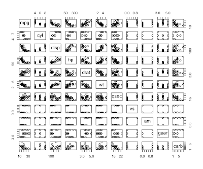
R comes with a dataset called mtcars based on Motor Trend road tests for 32 cars in the 1973-74 model year. They recorded 11 statistics about each model of car. We can get a quick initial look using the pairs function which plots a thumbnail scatterplot for every pair of variables. Pairs is designed to work on numbers, but they've coded categorical values as integers in this data, so it works.
> names(mtcars)
 [1] "mpg"  "cyl"  "disp" "hp"   "drat" "wt"   "qsec" "vs"   "am"   "gear" "carb"
> pairs(mtcars)
Question 4.7 asks us to describe any trends relating weight, fuel efficiency, and number of cylinders. They also make the distinction between American made cars and imports, another categorical value along with cylinders. Let's make a two-panel plot. First, we'll make a boxplot comparing the distribution of mileage for imports and domestics. In the second panel, we'll combine all four variables.
# make a copy of mtcars 'cause we're going to add a column
cars <- mtcars

# add origin column as a factor to cars data frame
imports <- c(1:3, 8:14, 18:21, 26:28, 30:32)
origin <- rep("domestic", nrow(mtcars))
origin[imports] <- "import"
cars$origin <- factor(origin, levels=c('import', 'domestic'))

# make a vector of colors to color the data points
us.col <- rgb(0,0,255,192, maxColorValue=255)
im.col <- rgb(0,255,0,192, maxColorValue=255)
col <- rep(us.col, nrow(cars))
col[imports] <- im.col

# set up a two panel plot
par(mfrow=c(1,2))
par(mar=c(5,4,5,1)+0.1)

# draw boxplot in first panel
boxplot(mpg ~ origin, data=cars, col=c(im.col, us.col), outpch=19, outcol=c(us.col, im.col), ylab="mpg")
grid(nx=NA, ny=NULL)

# draw scatterplot in second panel
par(mar=c(5,0.5,5,2)+0.1)
plot(mpg~wt, data=cars, col=col, yaxt='n', pch=as.character(cars$cyl), xlab="weight (thousands of lbs)")
grid(nx=NA, ny=NULL)

# fit a line describing mpg as a function of weight
res <- lm(mpg ~ wt, data=cars)
abline(res, col=rgb(255,0,0,64, maxColorValue=255), lty=2)

# return parameters to defaults
par(mar=c(5,4,4,2)+0.1)
par(mfrow=c(1,1))
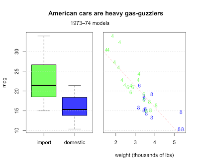
Domestics fair worse, but why? For one thing, the most fuel efficient cars are all light imports with 4 cylinder engines. Domestic cars are heavier with bigger engines and get worse milage. Other factors are certainly involved, but weight does a pretty good job of explaining fuel consumption, with a correlation of almost 87%.
> cor(cars$wt, cars$mpg)
[1] -0.8676594
Of course, fuel economy is not all there is to life on the open road. What about speed? We have quarter mile times, which probably measure acceleration better than top speed. We might hunt for variables that explain quarter mile performance by doing scatterplots and looking for correlation. The single factor that best correlates with qsec is horsepower. But a combination of factors does noticeably better - the power to weight ratio.
rm(origin)
attach(cars)

# transmission type encoded by color
palette <- c("#23809C","#7A1305")
col <- sapply(cars$am, function(x) palette[as.integer(x)+1])

# 5 panels
par(mfrow=c(1,5), omi=c(0,0.6,0.5,0.2))
par(mar=c(5,0.5,4,0.5)+0.1)

# weight
plot(qsec ~ wt, ylab="", xlab="weight", col= col, pch=as.character(cars$cyl))
mtext(sprintf("%.3f",cor(qsec,wt)), side=3)
grid(nx=NA, ny=NULL)

# displacement
plot(qsec ~ disp, ylab="", yaxt='n', xlab="displacement", col= col, pch=as.character(cars$cyl))
mtext(sprintf("%.3f",cor(qsec,disp)), side=3)
axis(2,labels=F, tick=T)
grid(nx=NA, ny=NULL)

# displacement / weight
plot(qsec ~ I(disp/wt), ylab="", yaxt='n', xlab="disp/wt", col= col, pch=as.character(cars$cyl))
mtext(sprintf("%.3f",cor(qsec,disp/wt)), side=3)
axis(2,labels=F, tick=T)
grid(nx=NA, ny=NULL)

# power
plot(qsec ~ hp, ylab="", yaxt='n', xlab="hp", col= col, pch=as.character(cars$cyl))
mtext(sprintf("%.3f",cor(qsec,hp)), side=3)
axis(2,labels=F, tick=T)
grid(nx=NA, ny=NULL)

# power / weight
plot(qsec ~ I(hp/wt), ylab="", yaxt='n', xlab="hp/wt", col= col, pch=as.character(cars$cyl))
mtext(sprintf("%.3f",cor(qsec,hp/wt)), side=3)
axis(2,labels=F, tick=T)
grid(nx=NA, ny=NULL)

# restore defaults
par(mar=c(5,4,4,2)+0.1)
par(mfrow=c(1,1), omi=c(0,0,0,0))

# add titles and legend
title("What factors influence acceleration?")
mtext("quarter mile time in seconds", side=2, padj=-4)
legend(x=88,y=21.5,c('automatic','manual'), fill=palette[c(1,2)], cex=0.6)

detach(cars)
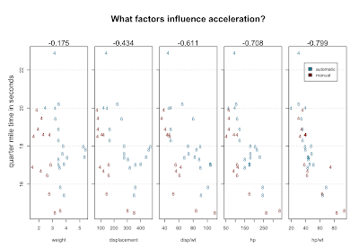
The numbers above the scatterplots are correlation with qsec. Using position, character, color, multi-part graphs and ratios we've managed to visualize 5 variables, which show increasingly good correlation with the variable we're trying to explain.
Here's one theory that might emerge from staring at this data: 4-bangers with automatic transmission are slow. Here's another theory: there's an error in the data. Look at the slow 4 cylinder way at the top. It's quarter mile is nearly three seconds longer than the next slowest car. An outlier like that seems to need an explanation. That car, according to mtcars, is the Mercedes 230. But, the 230 is listed right next to the 240D - D for diesel. The 240D is a solid car. Many are still running. But they're famously slow. What are the odds that the times for these two cars got transposed?
We can check if the data supports our theories about how cars work. For example, we might guess that car makers are likely to put bigger engines in heavier cars to maintain adequate performance at the expense of gas mileage. Comparing weight with numbers of cylinders in the scatterplot above supports this idea. Displacement measures the total volume of the cylinders and that must be closely related to the number of cylinders. Try plot(disp ~ as.factor(cyl), data=mtcars). Displacement and carburetors are big determinants of the horsepower of an engine. Statisticians might be horrified, but try this: plot(hp ~ I(disp * carb), data=mtcars). Multiplying displacement by carburetion is a quick and dirty hack, but in this case, it seems to work out well.
Chapter 4 introduces parts of R's type system, specifically, lists and data.frames, along with subsetting operations and the apply family of functions. I don't go into it here because that was the first thing I learned about R and if you're a programmer, you'll probably want to do the same. One thing the book doesn't cover at all, so far as I can tell, is clustering.
Take a look at the plots above and see if you can't see the cars clustering into familiar categories: the two super-fast sports cars, the three land-yacht luxury cars weighing in at over 5000 pounds a piece, the 8-cylinder muscle cars, and the 4-cylinder econo-beaters. We don't have to do this by eye, because R has several clustering algorithms built in.
Hierarchical clustering (hclust) works by repeatedly merging the two most similar items or existing clusters together. Determining 'most similar' requires a measure of distance. In general, coming up with a good distance metric takes careful thought specific to the problem at hand, but let's live dangerously.
> plot(hclust(dist(scale(mtcars))), main='Hierarchical clustering of cars', sub='1973-74 model year', xlab='Cars', ylab="")
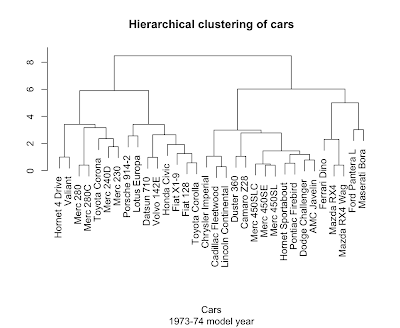
Not bad at all. The scale function helps out here by putting the columns on a common center and scale so the dist function ends up giving equal weight to each variable.
It's easy to analyze the bejeezes out of something you already you already know, like cars. The trick is to get a similar level of insight out of something entirely new.


 R Bloggers
Hi there,
ReplyDeletethanks for the post. Very instructive indeed.
I just want to mention that when I tried to replicate the second set of graphs I had to add 'data=cars' as an argument to the plot function.
Regards,
Ruben
Thanks Ruben, I'll fix that when I get a chance.
ReplyDelete