Several R functions take model formulae as parameters. Model formulae are symbolic expressions. They define a relationship between variables rather than an arithmetic expression to be evaluated immediately. Model formulae are defined with the tilde operator. A simple model formula looks like this:
response ~ predictor
Functions that accept formulae typically also take a data argument to specify a data frame in which to look up model variables and a subset argument to select certain rows in the data frame.
We've already seen model formula used for simple linear regression and with plot and boxplot, to show that American cars are heavy gas guzzlers. Two common uses of formula are:
- y ~ x where x and y are numeric
- x ~ f where x is numeric and f is a factor
The Lattice graphics package can accept more complicated model formulas of this form:
response ~ predictor | condition
We'll try this out with a dataset called kid.weights from the UsingR package. We get age, weight, height and gender for 250 kids ranging from 3 month to 12 years old.
library(UsingR)
library(lattice)
dim(kid.weights)
[1] 250   4
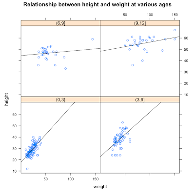
We expect weight and height to be related, but we're wondering if this relationship changes over time as kids grow. Often, when we want to condition on a quantitative variable (like age), we turn it into a categorical variable by binning. Here, we'll create 4 bins by taking age in 3 year intervals.
age.classes = cut(kid.weights$age/12, 3*(0:4))
unique(age.classes)
[1] (3,6]  (6,9]  (9,12] (0,3]
Levels: (0,3] (3,6] (6,9] (9,12]
With age as a factor, we can express our question as the model formula:
height ~ weight | age.classes
The lattice graphics function xyplot accepts this kind of formula and draws a panel for each level of the conditioning variable. The panels contain scatterplots of the response and predictor, in this case height and weight, divided into subsets by the conditioning variable. The book shows a little trick that let's us customize xyplot, adding a regression line to each scatterplots.
plot.regression = function(x,y) {
  panel.xyplot(x,y)
  panel.abline(lm(y~x))
}
We pass the helper function plot.regression as a custom panel function in xyplot.
xyplot( height ~ weight | age.classes, data=kid.weights, panel=plot.regression)

There's quite a bit more to model formulae, but that's all I've figured out so far.
More on formulae
- Chapter 11 Statistical models in R from An Introduction to R
- R's model formula
- I() can be used insulate arithmetic expressions within formulae.


 R Bloggers
No comments:
Post a Comment