Sunday, January 23, 2011

Using R for Introductory Statistics, Chapter 5

Any good stats book has to cover a bit of basic probability. That's the purpose of Chapter 5 of Using R for Introductory Statistics, starting with a few definitions:

Random variable
A random number drawn from a population. A random variable is a variable for which we define a range of possible values and a probability distribution. The probability distribution specifies the probability that the variable assumes any value in its range.

The range of a discrete random variable is a finite list of values. For any value k in the range, 0 ≤ P(X=k) ≤ 1. The sum over all values k in the range is 1.

R sample function implements these definitions. For example, let's ask R to create a six-sided die for us.

p.die <- rep(1/6,6)
sum(p.die)

Now, let's roll it 10 times.

die <- 1:6
sample(die, size=10, prob=p.die, replace=T)

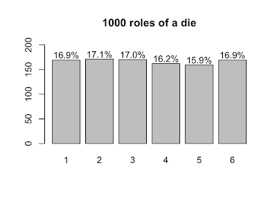
Now, let's roll 1000 dice and plot the results.

s <- table(sample(die, size=1000, prob=p.die, replace=T))
lbls = sprintf("%0.1f%%", s/sum(s)*100)
barX <- barplot(s, ylim=c(0,200))
text(x=barX, y=s+10, label=lbls)
Expected value
Expected value (or population mean) of a discrete random variable X is the weighted average of the values in the range of X.

In the case of our six-sided die, the expected value is 3.5, computed like so:

sum(die*p.die)

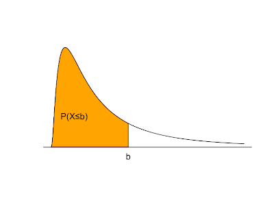
Things change a bit when we move from discrete to continuous random variables. A continuous random variable is described by a probability density function. If f(x) is the probability density of a random variable X, P(X≤b) is the area under f(x) and to the left of b. The total area under f(x) = 1. f(x) ≥ 0 for all possible values of X. P(X>b) = 1 - P(X≤b). The expected value is the balance point where exactly half of the total area under f(x) is to the right and half is to the left.
A random sample is a sequence of independent identically distributed random variables. A value derived from a random sample, such as sample mean, sample standard deviation, etc. is called a statistic. When we compute statistics of samples, our hope is that the sample statistic is not too far off from the equivalent measurement of the whole population.

The interesting thing is that derived statistics are also random variables. If we role our die several times, we have taken a random sample of size n. That sample can be summarized by computing its mean, denoted by X bar.

The sample mean is, itself, a random variable with its own distribution. So, let's take a look at that distribution. Because we'll use it later, let's define a function that generates a bunch of samples of size n and computes their means. It returns a vector of sample means.

generate.sample.means <- function(n) {
  sample.means <- numeric()
  for (i in 1:1000) { 
    sample.means <- append(sample.means, sum(sample(die, size=n, prob=p.die, replace=T))/n)
  }
  return (sample.means)
}
sample.means <- generate.sample.means(100)
plot(density(sample.means), main="Distribution of sample means",xlab="sample mean", col="orange")
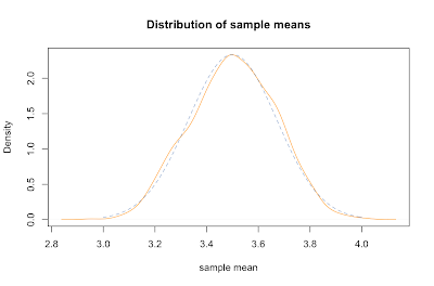
Not coincidentally, it fits pretty closely to a normal distribution (dashed blue line). It's mean is about the same as the parent population, namely right around 3.5. The standard deviation of the sample means can be derived by dividing the standard deviation of the parent population by the square root of the sample size: σ / √ n.

Let's compare the mean and sd of our sample with predicted values. We compute the standard deviation of our parent population of die rolls by squaring the deviation from the mean for each possible value and averaging that. Dividing that by the square root of our sample size gives the predicted sd of our sample means, about 0.17, which is about spot on with the actual sd.

> mean(sample.means)
[1] 3.49002
> sd(sample.means)
[1] 0.1704918
> sqrt(sum( (1:6-3.5)^2 ) / 6) / sqrt(100)
[1] 0.1707825

To overlay the normal distribution on the plot above, we used R's dnorm function like this:

x = seq(3,4,0.01)
lines(x=x,y=dnorm(x,mean=3.5,sd=0.1707825), col=rgb(0x33,0x66,0xAA,0x90,maxColorValue=255), type="l", lty=2)

Inspection of the formula for the standard deviation of sample means supports our common sense intuition that a bigger sample will more likely reflect the whole population. In particular, as the size of our sample goes up, our estimated mean is more likely to be closer to the parent population mean. This idea is known as the law of large numbers. We can show that it works by creating similar plots with increasing n.

sample.means <- generate.sample.means(100)
plot(density(sample.means), main="Distribution of sample means", xlab="sample mean", col="yellow", xlim=c(3.2,3.8), ylim=c(0,8))
sample.means <- generate.sample.means(500)
lines(density(sample.means), col="orange")
sample.means <- generate.sample.means(1000)
lines(density(sample.means), col="red")
legend(3.6,7,c("n=100","n=500","n=1000"), fill=c("yellow", "orange", "red"))
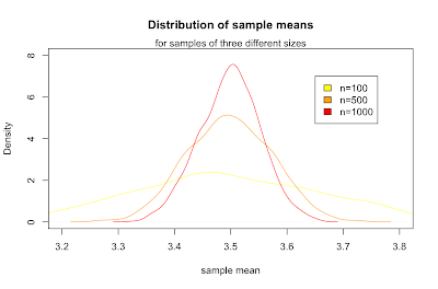
What we've just discovered is the central limit theorem, which states that for any parent population with mean μ and standard deviation σ, the sampling distribution for large n is a normal distribution with mean μ and standard deviation σ / √ n. Putting that in terms of the standard normal distribution Z gives:

It's a little surprising that the normal distribution arises out of a means of samples from a discrete uniform distribution. More surprisingly, samples from any parent distribution give rise to the normal distribution in exactly the same way. Next, we'll look at several widely used families of distributions and R's functions for working with them.

Notes

The graph above shaded in orange serving as an example probability density function is produced with the following R code:

plot(x=c(seq(0,5,0.01)), y=c(dlnorm(x=seq(0,5,0.01),meanlog=0,sdlog=1)), type="l", xlab='', ylab='', yaxt="n", xaxt="n", bty="n")
polygon(x=c(seq(0,2,0.01),2), y=c(dlnorm(x=seq(0,2,0.01),meanlog=0,sdlog=1),0), col="orange")
mtext('b', at=c(2), side=1)
text(0.6,0.2,"P(X≤b)")
abline(c(0,0),c(0,5))

More Using R for Introductory Statistics

Sunday, January 09, 2011

Using R for Introductory Statistics, Chapter 4, Model Formulae
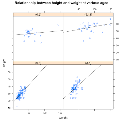
Several R functions take model formulae as parameters. Model formulae are symbolic expressions. They define a relationship between variables rather than an arithmetic expression to be evaluated immediately. Model formulae are defined with the tilde operator. A simple model formula looks like this:

response ~ predictor

Functions that accept formulae typically also take a data argument to specify a data frame in which to look up model variables and a subset argument to select certain rows in the data frame.

We've already seen model formula used for simple linear regression and with plot and boxplot, to show that American cars are heavy gas guzzlers. Two common uses of formula are:

  • y ~ x where x and y are numeric
  • x ~ f where x is numeric and f is a factor

The Lattice graphics package can accept more complicated model formulas of this form:

response ~ predictor | condition

We'll try this out with a dataset called kid.weights from the UsingR package. We get age, weight, height and gender for 250 kids ranging from 3 month to 12 years old.

library(UsingR)
library(lattice)
dim(kid.weights)
[1] 250   4

We expect weight and height to be related, but we're wondering if this relationship changes over time as kids grow. Often, when we want to condition on a quantitative variable (like age), we turn it into a categorical variable by binning. Here, we'll create 4 bins by taking age in 3 year intervals.

age.classes = cut(kid.weights$age/12, 3*(0:4))
unique(age.classes)
[1] (3,6]  (6,9]  (9,12] (0,3] 
Levels: (0,3] (3,6] (6,9] (9,12]

With age as a factor, we can express our question as the model formula:

height ~ weight | age.classes

The lattice graphics function xyplot accepts this kind of formula and draws a panel for each level of the conditioning variable. The panels contain scatterplots of the response and predictor, in this case height and weight, divided into subsets by the conditioning variable. The book shows a little trick that let's us customize xyplot, adding a regression line to each scatterplots.

plot.regression = function(x,y) {
  panel.xyplot(x,y)
  panel.abline(lm(y~x))
}

We pass the helper function plot.regression as a custom panel function in xyplot.

xyplot( height ~ weight | age.classes, data=kid.weights, panel=plot.regression)

There's quite a bit more to model formulae, but that's all I've figured out so far.

More on formulae

Monday, December 27, 2010

Cloud bioinformatics

Personally, the thing I love about cloud computing is never having to ask permission. There's no ops guy or pointy-haired boss between me and the launch-instance button. As lovely as that is, the cloud is also a powerful tool for scientific computing, particularly bioinformatics.

Next-gen sequencing, which can produce gigabytes per day, is one factor pushing bioinformatics into the cloud. Data analysis is now the major bottleneck for sequencing-based experiments. Labs are finding out that generating sequencing data is getting to be cheaper than processing it. According to Dave O’Connor Lab at the University of Wisconsin's Department of Pathology and Laboratory Medicine, "There is a real disconnect between the ability to collect next-generation sequence data (easy) and the ability to analyze it meaningfully (hard)."

O'Connor's group works with LabKey Software, a Seattle-based bioinformatics software company founded by the Fred Hutchinson Cancer Research Center. LabKey develops open-source data management software for proteomics, flow cytometry, plate-based assay, and HIV vaccine study data, described in a presentation by Lead Developer Adam Rauch. Their technology stack seems to include: Java, Spring, GWT, Lucene and Gauva (aka Google Collections). LabKey integrates with the impressive Galaxy genomics workflow system and the Trans-Proteomic Pipeline (TPP).

A good part of modern biology boils down to mining biological data, with the goal of correlating sequence, transcription or peptides to outputs like function, phenotype or disease. Machine learning and statistical modeling tend toward long-running CPU-intensive jobs that get run intermittently as new data arrives, making them ideal candidates for the cloud.

Amazon's EC2 seems to be better positioned than either Microsoft's Azure or Google's AppEngine for scientific computing. Amazon has been ahead of the curve in seeing the opportunity in genomic data overload. Microsoft has made some welcome efforts to attract scientific computing, including the Microsoft Biology Foundation and grants for scientific computing in Azure. But they're fighting a headwind arising from proprietary licensing and a closed ecosystem. Oddly, considering Google's reputation for openness, AppEngine looks surprisingly restrictive. Research computing typically involves building and installing binaries, programming in an odd patchwork of languages and long running CPU intensive tasks, none of which is particularly welcome on AppEngine. Maybe Google has a better offering in the works?

It's worth noting that open-source works without friction in cloud environments while many proprietary vendors have been slow to adapt their licensing models to on-demand scaling. For example, lots of folks are using R for machine learning in the cloud, while MatLab is still bogged down in licensing issues. The not-having-to-ask-permission aspect is lost.

According to Xconomy, Seattle has a growing advantage in the cloud. There are several Seattle companies operating in the bioinformatics and cloud spaces. Sage Bionetworks, also linked to FHCRC, was founded by Eric Schadt, also of Pacific Biosciences, and Stephen Friend former founder of Rosetta Inpharmatics. Revolution Analytics sells a scalable variant of R for all kinds of applications including life sciences. Seattle hosts a lot of activity in analytics, cloud computing and biotechnology, which will keep Seattle on the technology map for some time to come.

Sunday, December 12, 2010

Using R for Introductory Statistics, Chapter 4

Chapter 4 of Using R for Introductory Statistics gets us started working with multivariate data. The question is: what are the relationships among the variables? One way to go about answering it is by pairwise comparison of variables. Another technique is to divide the data into categories by the values of some variables and analyze the remaining variables within each category. Different facets of the data can be encoded with color, shape and position to create visualizations that show graphically the relationships between several variables.

Taking variables one or two at a time, we can rely on our previous experience and apply our toolbox of univariate and bivariate techniques, such as histograms, correlation and linear regression.

We can also hold some variables constant and analyze the remaining variables in that context. Often, this involves conditioning on a categorical variable, as we did in Chapter 3 by splitting marathon finishing time into gender and age classes. As another example, the distribution of top speeds of italian sports cars describes a dependent variable, top speed, conditioned on two categorical variables, country of origin (Italy) and category (sports car). Because they're so familiar, cars make a great example.

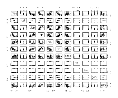
R comes with a dataset called mtcars based on Motor Trend road tests for 32 cars in the 1973-74 model year. They recorded 11 statistics about each model of car. We can get a quick initial look using the pairs function which plots a thumbnail scatterplot for every pair of variables. Pairs is designed to work on numbers, but they've coded categorical values as integers in this data, so it works.

> names(mtcars)
 [1] "mpg"  "cyl"  "disp" "hp"   "drat" "wt"   "qsec" "vs"   "am"   "gear" "carb"
> pairs(mtcars)

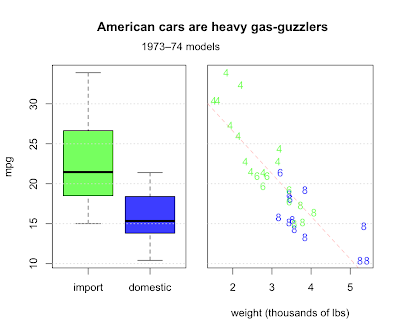
Question 4.7 asks us to describe any trends relating weight, fuel efficiency, and number of cylinders. They also make the distinction between American made cars and imports, another categorical value along with cylinders. Let's make a two-panel plot. First, we'll make a boxplot comparing the distribution of mileage for imports and domestics. In the second panel, we'll combine all four variables.

# make a copy of mtcars 'cause we're going to add a column
cars <- mtcars

# add origin column as a factor to cars data frame
imports <- c(1:3, 8:14, 18:21, 26:28, 30:32)
origin <- rep("domestic", nrow(mtcars))
origin[imports] <- "import"
cars$origin <- factor(origin, levels=c('import', 'domestic'))

# make a vector of colors to color the data points
us.col <- rgb(0,0,255,192, maxColorValue=255)
im.col <- rgb(0,255,0,192, maxColorValue=255)
col <- rep(us.col, nrow(cars))
col[imports] <- im.col

# set up a two panel plot
par(mfrow=c(1,2))
par(mar=c(5,4,5,1)+0.1)

# draw boxplot in first panel
boxplot(mpg ~ origin, data=cars, col=c(im.col, us.col), outpch=19, outcol=c(us.col, im.col), ylab="mpg")
grid(nx=NA, ny=NULL)

# draw scatterplot in second panel
par(mar=c(5,0.5,5,2)+0.1)
plot(mpg~wt, data=cars, col=col, yaxt='n', pch=as.character(cars$cyl), xlab="weight (thousands of lbs)")
grid(nx=NA, ny=NULL)

# fit a line describing mpg as a function of weight
res <- lm(mpg ~ wt, data=cars)
abline(res, col=rgb(255,0,0,64, maxColorValue=255), lty=2)

# return parameters to defaults
par(mar=c(5,4,4,2)+0.1)
par(mfrow=c(1,1))

Domestics fair worse, but why? For one thing, the most fuel efficient cars are all light imports with 4 cylinder engines. Domestic cars are heavier with bigger engines and get worse milage. Other factors are certainly involved, but weight does a pretty good job of explaining fuel consumption, with a correlation of almost 87%.

> cor(cars$wt, cars$mpg)
[1] -0.8676594

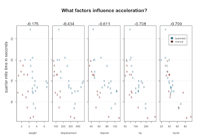
Of course, fuel economy is not all there is to life on the open road. What about speed? We have quarter mile times, which probably measure acceleration better than top speed. We might hunt for variables that explain quarter mile performance by doing scatterplots and looking for correlation. The single factor that best correlates with qsec is horsepower. But a combination of factors does noticeably better - the power to weight ratio.

rm(origin)
attach(cars)

# transmission type encoded by color
palette <- c("#23809C","#7A1305")
col <- sapply(cars$am, function(x) palette[as.integer(x)+1])

# 5 panels
par(mfrow=c(1,5), omi=c(0,0.6,0.5,0.2))
par(mar=c(5,0.5,4,0.5)+0.1)

# weight
plot(qsec ~ wt, ylab="", xlab="weight", col= col, pch=as.character(cars$cyl))
mtext(sprintf("%.3f",cor(qsec,wt)), side=3)
grid(nx=NA, ny=NULL)

# displacement
plot(qsec ~ disp, ylab="", yaxt='n', xlab="displacement", col= col, pch=as.character(cars$cyl))
mtext(sprintf("%.3f",cor(qsec,disp)), side=3)
axis(2,labels=F, tick=T)
grid(nx=NA, ny=NULL)

# displacement / weight
plot(qsec ~ I(disp/wt), ylab="", yaxt='n', xlab="disp/wt", col= col, pch=as.character(cars$cyl))
mtext(sprintf("%.3f",cor(qsec,disp/wt)), side=3)
axis(2,labels=F, tick=T)
grid(nx=NA, ny=NULL)

# power
plot(qsec ~ hp, ylab="", yaxt='n', xlab="hp", col= col, pch=as.character(cars$cyl))
mtext(sprintf("%.3f",cor(qsec,hp)), side=3)
axis(2,labels=F, tick=T)
grid(nx=NA, ny=NULL)

# power / weight
plot(qsec ~ I(hp/wt), ylab="", yaxt='n', xlab="hp/wt", col= col, pch=as.character(cars$cyl))
mtext(sprintf("%.3f",cor(qsec,hp/wt)), side=3)
axis(2,labels=F, tick=T)
grid(nx=NA, ny=NULL)

# restore defaults
par(mar=c(5,4,4,2)+0.1)
par(mfrow=c(1,1), omi=c(0,0,0,0))

# add titles and legend
title("What factors influence acceleration?")
mtext("quarter mile time in seconds", side=2, padj=-4)
legend(x=88,y=21.5,c('automatic','manual'), fill=palette[c(1,2)], cex=0.6)

detach(cars)

The numbers above the scatterplots are correlation with qsec. Using position, character, color, multi-part graphs and ratios we've managed to visualize 5 variables, which show increasingly good correlation with the variable we're trying to explain.

Here's one theory that might emerge from staring at this data: 4-bangers with automatic transmission are slow. Here's another theory: there's an error in the data. Look at the slow 4 cylinder way at the top. It's quarter mile is nearly three seconds longer than the next slowest car. An outlier like that seems to need an explanation. That car, according to mtcars, is the Mercedes 230. But, the 230 is listed right next to the 240D - D for diesel. The 240D is a solid car. Many are still running. But they're famously slow. What are the odds that the times for these two cars got transposed?

We can check if the data supports our theories about how cars work. For example, we might guess that car makers are likely to put bigger engines in heavier cars to maintain adequate performance at the expense of gas mileage. Comparing weight with numbers of cylinders in the scatterplot above supports this idea. Displacement measures the total volume of the cylinders and that must be closely related to the number of cylinders. Try plot(disp ~ as.factor(cyl), data=mtcars). Displacement and carburetors are big determinants of the horsepower of an engine. Statisticians might be horrified, but try this: plot(hp ~ I(disp * carb), data=mtcars). Multiplying displacement by carburetion is a quick and dirty hack, but in this case, it seems to work out well.

Chapter 4 introduces parts of R's type system, specifically, lists and data.frames, along with subsetting operations and the apply family of functions. I don't go into it here because that was the first thing I learned about R and if you're a programmer, you'll probably want to do the same. One thing the book doesn't cover at all, so far as I can tell, is clustering.

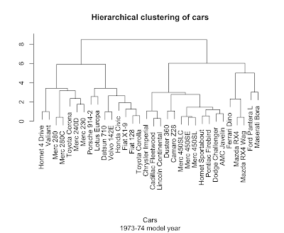
Take a look at the plots above and see if you can't see the cars clustering into familiar categories: the two super-fast sports cars, the three land-yacht luxury cars weighing in at over 5000 pounds a piece, the 8-cylinder muscle cars, and the 4-cylinder econo-beaters. We don't have to do this by eye, because R has several clustering algorithms built in.

Hierarchical clustering (hclust) works by repeatedly merging the two most similar items or existing clusters together. Determining 'most similar' requires a measure of distance. In general, coming up with a good distance metric takes careful thought specific to the problem at hand, but let's live dangerously.

> plot(hclust(dist(scale(mtcars))), main='Hierarchical clustering of cars', sub='1973-74 model year', xlab='Cars', ylab="")

Not bad at all. The scale function helps out here by putting the columns on a common center and scale so the dist function ends up giving equal weight to each variable.

It's easy to analyze the bejeezes out of something you already you already know, like cars. The trick is to get a similar level of insight out of something entirely new.

Links to more...

Saturday, November 27, 2010

Git cheat sheet

I'm trying to wrap my head around Git, Linus Torvalds's complicated but powerful distributed version control system. Here's some quick notes and a wad of links:

Configure

git config --global user.name "John Q. Hacker"
git config --global user.email "jqhacker@somedomain.com"

Start a new empty repository

git init
mkdir fooalicious
cd fooalicious
git init
touch README
git add README
git commit -m 'first commit'
git remote add origin git@github.com:nastyhacks/foo.git
git push -u origin master

Create a local copy of a remote repository

git clone [remote-repository]

Commit to local repository

git commit -a -m "my message"

Review previous commits

git log --name-only

See what branches exist

git branch -v

Switch to a different branch

git checkout [branch you want to switch to]

Create a new branch and switch to it

git checkout -b [name of new branch]

Merge

git merge mybranch

merge the development in the branch "mybranch" into the current branch.

Show remote repositories tracked

git remote -v

Track a remote repository

git remote add --track master origin git@github.com:jqhacker/foo.git

Retrieve from a remote repository

git fetch

Git fetch grabs changes from remote repository and puts it in your repository's object database. It also fetches branches from remote repository and stores them as remote-tracking branches. (see this.)

Fetch and merge from a remote repository

git pull

Push to a remote repository

git push

Pull changes from another fork

git checkout -b otherguy-master master
git fetch https://github.com/otherguy/foo.git master
git merge otherguy-master/master

git checkout master
git merge otherguy-master
git push origin master

Resolve merge conflict in favor of us/them

git checkout --theirs another.txt
git checkout --ours some.file.txt

Diff between local working directory and remote tracking branch

Say you're working with Karen on a project. She adds some nifty features to the source file nifty_files/our_code.py. You'd like to diff your local working copy against hers to see the changes, and prepare to merge them in. First, make sure you have a remote tracking branch for Karen's repo.

git remote add karen git://github.com/karen/our_project.git
git remote -v

The results ought to look something like this:

karen git://github.com/karen/our_project.git (fetch)
karen git://github.com/karen/our_project.git (push)
origin git@github.com:cbare/our_project.git (fetch)
origin git@github.com:cbare/our_project.git (push)

Next, fetch Karen's changes into your local repo. Git can't do a diff across the network, so we have to get a local copy of Karen's commits stored in a remote tracking branch.

git fetch karen

Now, we can do our diff.

git diff karen/master:nifty_files/our_code.py nifty_files/our_code.py

Fixing a messed up working tree

git reset --hard HEAD

return the entire working tree to the last committed state

Shorthand naming

Branches, remote-tracking branches, and tags are all references to commits. Git allows shorthand, so you mostly ever shorthand rather than full names:

  • The branch "test" is short for "refs/heads/test".
  • The tag "v2.6.18" is short for "refs/tags/v2.6.18".
  • "origin/master" is short for "refs/remotes/origin/master".

Links

Monday, November 15, 2010

Tech Industry Gossip

Welcome to the new decade: Java is a restricted platform, Google is evil, Apple is a monopoly and Microsoft are the underdogs

I mostly try to ignore tech industry gossip. But, there's a lot of it, lately. And underlying the shenanigans are big changes in the computing landscape.

First, there's the flurry of lawsuits. This is illustrated nicely by the Economist in The great patent battle. There are several similar graphs of the patent thicket floating around. IP law is increasingly being used as a tool to lock customers in and competitors out. We can expect the (sarcastically named) "Citizens United" ruling on campaign finance to result in more of this particular kind of antisocial behavior.

Google and Facebook are in a pitched battle over your personal data and engineering talent. Google engineers, apparently, are trying to jump over to Facebook prior to what promises to be a huge IPO.

Apple caused quite a kerfuffle by deprecating Java on Mac OS X. After remaining ominously silent for weeks, Oracle seems to have lined up both Apple and IBM behind OpenJDK. Apache Harmony looks to be a casualty of this maneuvering. Harmony, probably not coincidentally, is the basis for parts of Google's Android and Oracle is suing Google over Android's use of Java technology.

Microsoft seems to be waning in importance along with the desktop in general. Ray Ozzie, Chief Architect since 2005, announced that he was leaving, following Robbie Bach of the XBox division and Stephen Elop, now running Nokia. I spoke with one MS marketing guy who said of Ozzie, "Lost him? I'd say we got rid of him!" A lesser noticed departure, that of Jython and Iron Python creator Jim Hugunin may also be telling. Profitable stagnation seems to be the game plan there.

Adobe's been struggling to the point where the NYTimes asked where does Adobe go from here? They took a beating over flash performance and rumors circulated briefly of a buyout by Microsoft.

The cloud is where a lot of the action in software development is moving. Mobile has been growing in importance by leaps and bounds ever since the launch of the iPhone. Cloud computing and consumer devices like smart phones, tablets, and even Kindles are complementary to a certain extent. The economics of cloud computing are hard to argue with. (See James Hamilton's slides and video on data centers.)

Another part of what's changing is a swing of the pendulum away from openness and back towards the walled gardens that most of us thought were left behind in the ashes of Compuserve and AOL. Ironically enough, Apple has become the poster child of walled gardens, with iTunes and the app store. ...the mobile carriers even more so. And the cloud infrastructures of both Microsoft's Azure and (to a lesser degree) Google's App Engine are proprietary. Out of the big 3, Amazon's EC2 is, by far, the most open. Mark Zuckerberg says, "I’m trying to make the world a more open place." But, to Tim Berners-Lee, Facebook and Apple threaten the internet.

There's plenty of money in serving the bulk population. That's why Walmart is so huge. My fear is that in a rush to provide "sugar water" to consumers, the computing industry will neglect the creative people that made the industry so vibrant. But, not to worry. Ray Ozzie's essay Dawn of a new Day does a nice job of putting into perspective the embarrassment of riches that technology has yielded. We're just at the beginning of figuring out what to do with it all.

Tuesday, October 19, 2010

Message queues with Python

A while back, I wanted to build a web front end for a long-running python script. I started with a basic front end using Django. Django is a pleasantly straight-forward web framework, quite similar to Rails, easy to learn (with the help of the excellent and free Django book), and generally trouble-free. Pylons is an alternate choice.

Because the computation was fairly resource intensive, I thought to introduce a queue. The web-app could then concentrate on collecting the necessary input from the user and dumping a job on the queue, leaving the heavy lifting to a worker process (or several). We'd redirect the user to a status page where s/he could monitor progress and get results upon completion. Sounds simple enough, right? I figured my worker processes would look something like this:

big_chunka_data = load_big_chunka_data()
mo_data = load_mo_data()
queue = init_queue("http://myserver.com:12345", "user", "pw", "etc")

while <not-done>:
    try:
        message = queue.block_until_we_can_take_a_message()
        if message says shutdown: shutdown
        big_computation(message['param'],
                        message['foo'],
                        big_chunka_data,
                        mo_data)
    except e:
        log_errors(e)

...and the whole pile-o-junk would look like this:

Start up a handful of workers and a nice load balancing effect comes for free. Slow heavily loaded workers will take fewer jobs, while faster workers take more. I was also hoping for a good answer to the question, "What happens when one of our workers dies?"

Options

There are a ridiculous number of message queues to choose from. I looked at beanstalk which is nice and simple, but its python binding, pybeanstalk seems to be out of date. There's gearman, from Danga the source of memcached. That looked fairly straight forward as well, although be careful to get the newer python binding. Python, itself, now offers the multiprocessing module which has a queue.

One intriguing option is ZeroMQ (aka 0MQ). It's message queueing without a queue. It's brokerless, meaning there's no external queue server process. Messages are routed in common MQ patterns right down at the network level. Of course, if you want store and forward, you're on your own for the persistence part. Still, very cool... Python bindings for ZeroMQ are found in pyzmq.

Several on the seattle python mailing list recommended Celery. After a (superficial) look, Celery seemed too RPC-ish for my taste. I'm probably being up-tight, but when using a queue, I'd rather think in terms of sending a message than calling a function. That seems more decoupled and avoids making assumptions about the structure of the conversation and what's on the other side. I should probably lighten up. Celery is built on top of RabbitMQ, although they support other options.

RabbitMQ and Carrot

RabbitMQ, now part of the SpringSource empire (in turn owned by VMWare), aims to compete with Apache ActiveMQ as a full on enterprise messaging system based on the AMQP spec. I installed RabbitMQ using MacPorts, where you'll notice that RabbitMQ pulls in an absurd amount of dependencies.

sudo port selfupdate
sudo port install rabbitmq-server

For getting python to talk to RabbitMQ, Carrot is a nice option. It was a bit confusing at first, but some nice folks on the carrot-users mailing list set me straight. Apparently, Carrot's author is working on a rewrite called Kombu.

Here's what worked for me. A producer sends Python dictionary objects, which get turned into JSON. My example code is only slightly modified from Creating a Connection in the Carrot documentation. You'll need a little RabbitMQ terminology to understand the connection methods.

  • queues are addresses of receivers
  • exchanges are routers with their own process
  • virtual hosts are the unit of security

Producer

from carrot.connection import BrokerConnection
from carrot.messaging import Publisher

conn = BrokerConnection(hostname="localhost", port=5672,
                          userid="guest", password="guest",
                          virtual_host="/")

publisher = Publisher(connection=conn,
                    exchange="feed", routing_key="importer")

for i in range(30):
   publisher.send({"name":"foo", "i":i})
publisher.close()

The consumers print out the messages as they arrive, then sleep for a bit to simulate long-running tasks. I tested by starting two consumers, one with a longer sleep time. Then I started a producer and saw that the slower consumer got fewer messages, which is what I expected. Note that setting prefetch_count to 1 is necessary to achieve this low-budget load balancing effect.

Consumer

import time
import sys
from carrot.connection import BrokerConnection
from carrot.messaging import Consumer

# supply an integer argument for sleep time to simulate long-running tasks
if (len(sys.argv) > 1):
    sleep_time = int(sys.argv[1])
else:
    sleep_time = 1

connection = BrokerConnection(hostname="localhost", port=5672,
                          userid="guest", password="guest",
                          virtual_host="/")

consumer = Consumer(connection=connection, queue="feed",
                    exchange="feed", routing_key="importer")

def import_feed_callback(message_data, message):
    print "-" * 80
    print message_data
    print message
    message.ack()
    print "-" * 80
    time.sleep(sleep_time)

consumer.register_callback(import_feed_callback)
consumer.qos(prefetch_count=1)

consumer.consume() 
while True: 
    connection.drain_events()

The project remains incomplete and I'm not at all ready to say this is the best way to go about it. It's just the first thing I got working. RabbitMQ seems maybe a little heavy for a simple task queue, but it's also well supported and documented.

It seems like this sort of thing is less mature in the Python world than in Java. It's moving fast though.

Links, links, links

Obsolete note: The version of RabbitMQ in MacPorts (1.7.2) at the time was a version behind and broken. I had to dig through the compiler error log and add a closing paren in line 100 of rabbit_exchange.erl.